I just ran into a (retrospectively) hilarious but subtle user interface #fail.
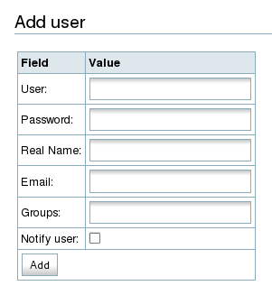
This is the Dokuwiki administrative panel for adding or editing a user account. Can you spot the potential problem here?

You might not see it right away, perhaps because you’re used to sites using a dynamic popup window for password confirmation.
Password confirmation is where you enter the new password, and are then asked to repeat it in a separate field, typically immediately following the first password field, to make sure that there are no typos (because after all, if the password isn’t what you thought it was, you might have a hard time logging in to fix it). Sometimes the confirmation field is right there in the form, and sometimes it pops up only after you finish entering data in the first password field.
But this interface doesn’t do a confirmation field at all. That makes sense, if looked at purely logically: I was logged in as the admin user, using the form to create a new kfogel account for myself. Since the password I’m entering is for kfogel, not admin, there’s no danger that I won’t be able to log back in and fix it if I get it wrong — I’d just log in as admin again, whose password is not being changed here.
The problem is expectations. With very other piece of software where I go through this routine, I have to enter the password twice (original plus confirmation). Reflexively, I did so here too. I know, it says “Real Name” next to the field, but, as with most users, what’s in front of my eyes is no match for what’s behind them. So I blithely entered the password into the second field too, thinking it was the password confirmation.
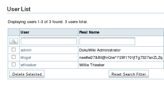
The result:

Oops :-).
While I was doing this, I was chatting in IRC with another admin of the same wiki. He was creating his own non-admin user account at the same time I was. After I made the above mistake, I told him about it in IRC — and while I was telling him about it, he was busy making the same mistake:
kfogel, I just pasted my password in the real name field too! What a blooper
At this point, I think that qualifies as a user interface bug, not a user bug!
The fix is easy: on or before submission, have the form notice if the Password and Real Name fields contain the same value, and ask the user if they really meant that. Filed as DokuWiki bug #2654.
