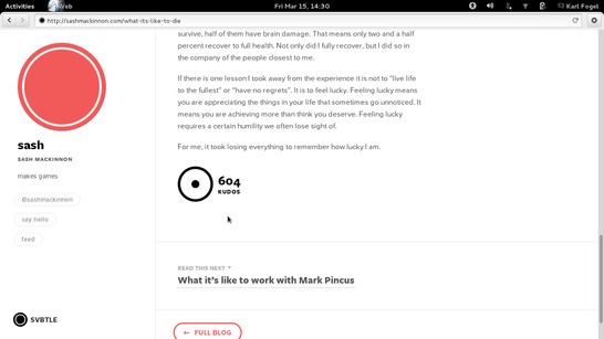
At the bottom of this otherwise good article is a little circle with the label “604 Kudos” next to it (the number will be different by the time you see it):
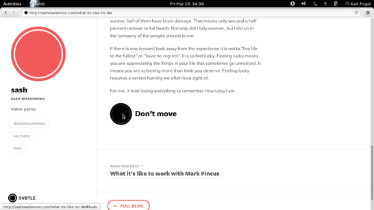
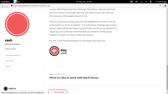
If you move your mouse pointer into that circle, without clicking, the circle reacts and the text changes for a second or so to “Don’t move”… then a moment later the picture is a little heart and the kudo count has been incremented by one. You’ve apparently kudo’d this article even though you didn’t click!


Look ma, no click!

WTF? That’s so obviously wrong that I am at a loss to explain how any web designer could possibly have thought it was okay. If there is one user interface contract every user knows, it’s that “If you didn’t click, you didn’t do it”. Even without that bizarre “Don’t move” imperative, it would have been a bad idea; with the imperative, it’s an intentional bad idea. What are we going to see next? Click-through EULAs that don’t actually wait for you to click, but claim your agreement because you hovered your mouse pointer in the wrong place?
This isn’t just a dark road. It’s a dark and silly road. Designers, resist please.
Update 2013-10-14: In the ultimate irony, someone whose blog uses this interface did a post about an Apple iPod UI Dark Pattern. I tweeted:
Post on iPod UI Dark Pattern http://blog.sefsar.com/the-ipods-dark-ui-pattern itself uses Kudo button dark pattern (as per http://www.rants.org/2013/03/15/wtf_new_ui_clicks_for_you/).
